I’ve been a long time open source user. Some advocates disparage closed source, particularly Microsoft. That’s not productive IMO. Compare feature and function. If it has the feature(s) and function(s) that you need then how well are they implemented and how easy are they use? Those are the crucial considerations.
Microsoft’s Office Suite has many features that most will never use, much less understand how to use (myself included). There are other features that are obvious once they’re experienced and their superior usability is obvious.
One example of that I just experienced was filtering a list of values formatted as currency. Some values had more than two decimals, they were from a formula. All needed to display as currency. So all needed to display two decimal places. As a result different values might display the same. e.g. 0.445 thru 0.454 all display as $0.45.
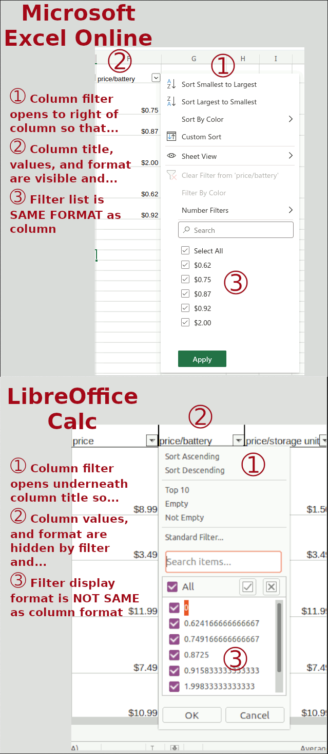
Excel and Calc displayed the values as currency with two decimals just fine. However the filter list in Excel shows the values in currency format, the filter list in Calc shows the values without the applied formatting. Not nearly as useful.
In Excel different values that format to the same display value show up only once in the filter list and format matches the applied display format. The filter filters the rows based on the display value. As a result anything from 0.445 thru 0.454 displays as $0.45. The filter list displays $0.45 only once no matter how many different values it actually represents. And when $0.45 is selected from the filter list all rows with values from 0.445 thru 0.454 are filtered.
In Calc, not so nice. Any values 0.445 thru 0.454 display as $0.45 using the applied currency format. However, the filter list displays the value without formatting. As a result, to filter all values that display as $0.45, every value in the list from 0.445 thru 0.454 must be selected to filter the list so that only display values of $0.45 are displayed.
There are other issues too. Check out the image for more.

An update to my post.
I have learned that more recent versions of LibreOffice than the one I was using do preserve the format as used in the column. And only one entry is presented for all entries that format to the displayed number.
IOW, if there are multiple calculation results that have a single display value that value will be shown only once in the filter list. And selecting that value from the filter shows or hides (depending on how the filter values are selected) all values that display that way.
This is true with LibreOffice 7.5.x and later. Thanks to the LibreOffice team for that information.
The filter list hiding the values in the column is still an issue. Bug#157177 in bugs.documentfoundation.org is devoted to tracking it.